Brainstrata
Making studying feel like momentum, not obligation.
The Brief
Students don't have a studying problem. They have a progress visibility problem.
Most learning apps give you content. Brainstrata gives you a dashboard that makes you feel the progress. Every session tracked, every streak counted, every subject visualised — so students always know exactly where they stand and what to do next.
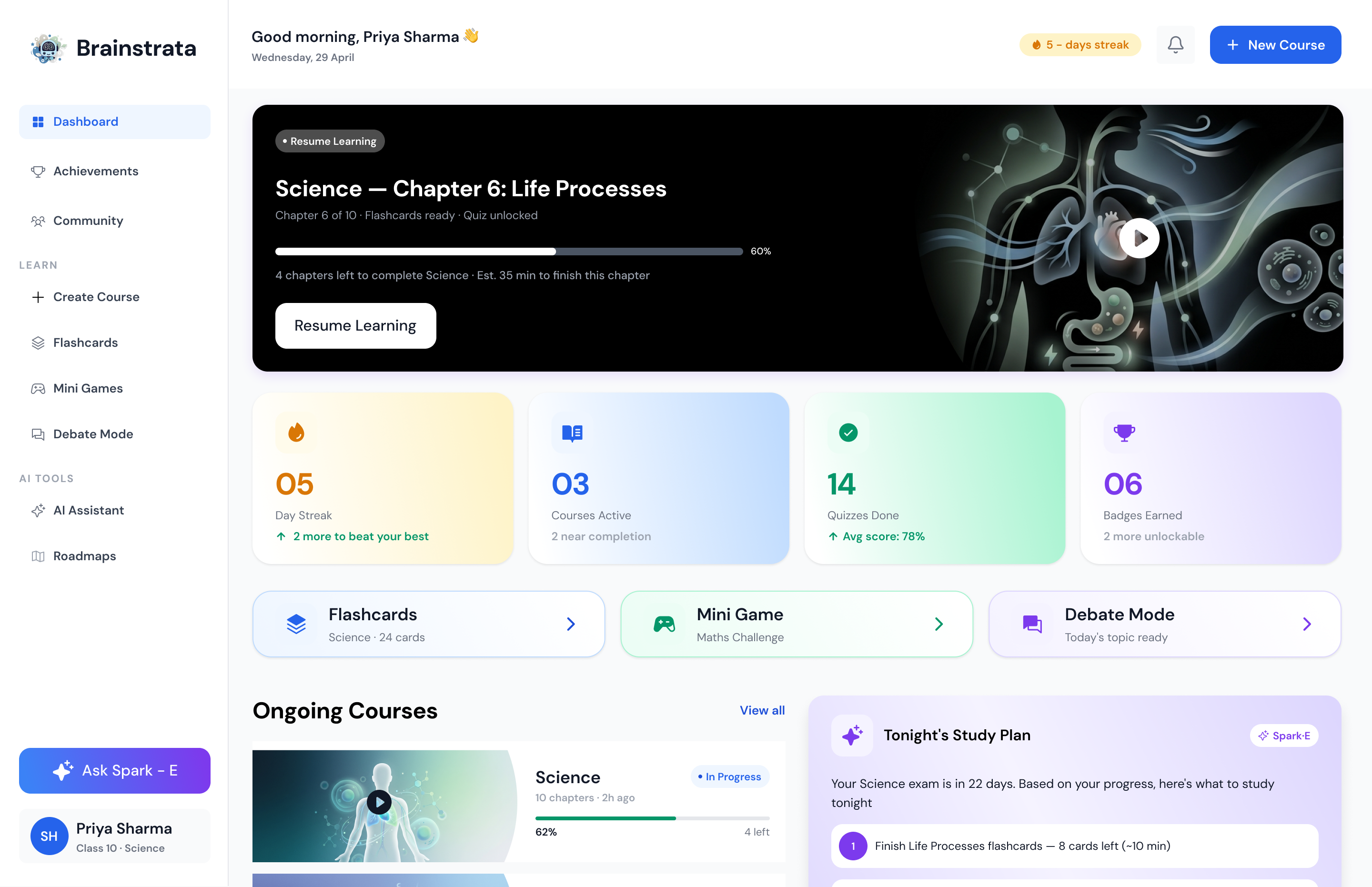
The brief: design a web-first student dashboard for Class 10 Science student Priya Sharma, that surfaces her most important next action the moment she opens the app.
The Challenge
One screen. Dozens of competing priorities.
Make it scannable in 3 seconds or less.
A student dashboard has a brutal information hierarchy problem — streaks, courses, quizzes, flashcards,
games, AI assistant, and tonight's study plan all demand attention. The challenge was deciding what earns
the top fold, and what gets discovered.
I had to design a system where the most urgent item (resume learning, tonight's plan) is always front and centre — without hiding the richness underneath.
Design Decisions
Resume first. Stats second. Discovery third.
The page opens on a "Resume Learning" hero banner — the single most important action. Below it, four stats tiles give an immediate pulse check. Then Ongoing Courses, Recently Accessed, and Tonight's Study Plan fill out the fold. Nothing is buried; everything has a place in the hierarchy.
The AI Assistant (Ask Spark) floats persistent but unobtrusive — always available, never in the way.
Research & Audit
Audited 5 edtech apps (Byju's, Khan Academy, Notion, Duolingo, Quizlet). Identified 3 core failure modes: buried progress, no daily anchor, no personalised next action.
Information Architecture
Mapped 8 content modules into a priority hierarchy. Defined the fold: Resume → Stats → Courses → Plan.
Typography System
Display 2XL → Overline, 1.25 modular scale, web-optimised at 14–16px body.
Component Library
Built reusable course cards, stat tiles, sidebar nav, flashcard preview, and AI assistant chip.
Visual Design
Dark theme (#1E1E1E bg), Electric Indigo accent, full dashboard at 1440px.
Prototype & Handoff
Figma prototype with hover states, sidebar active states, and banner scroll behaviour.
What I Wouldn't Do
I kept the sidebar collapsed by default. On purpose.
The sidebar has a lot — Dashboard, Achievements, Community, Create Course, Flashcards, Mini Games, Debate Mode, AI Assistant, Roadmaps. Expanding all of it by default would have overwhelmed the main content area. The design keeps the sidebar at icon-width until hovered, giving the dashboard breathing room.
I also resisted adding onboarding tooltips and popups. Students are goal-driven. They want to study, not take a product tour.
Selected Screens