FlowFund
Reducing spending anxiety for freelancers.
The Brief
Freelancers are bad at money because their tools weren't built for how they actually get paid.
A freelancer's income doesn't arrive on the 1st and 15th. It arrives whenever the client finally pays the invoice — sometimes in three installments, sometimes six weeks late.
Every budgeting app on the market assumes a salary. FlowFund was designed to assume nothing except uncertainty — and help users feel less afraid of it.
The Challenge
Income unpredictability is a UX problem, not just a financial one.
The core challenge wasn't the math. It was the emotion. Users didn't need more data — they needed to feel in control of data they already had.
Every design decision had to reduce anxiety, not add to it. That meant no red negative numbers. No alarming empty states. No "you've overspent" warnings without a clear next action.
What I Decided
Design for the feeling first, the function second.
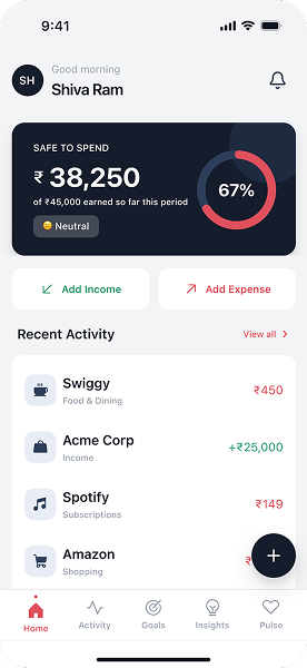
I anchored the entire visual language to calm confidence. Dark mode (easier on the eyes during late-night invoice chasing), green as the primary action color (not red), and a dashboard that showed your next 30 days of projected income before it showed your current balance.
The principle: if a component references a hardcoded hex value, it's not part of the system — it's just a Figma frame with a label on it.
Audit & Planning
Listed every visual property that repeated across projects. Found 40+ inconsistencies.
Primitive Color System
Built the full 22-color primitive palette, mapped to semantic aliases (background, text, border, action).
Typography System
Clash Display + Inter. 1.25 modular scale. All Figma text styles created.
Spacing, Radius, Shadows
8pt base grid. 18 spacing tokens. 8 radius values. 4 elevation levels.
Component Library
26 components built across 4 tiers: Primitives, Form Controls, Overlays, Navigation. Every component token-based.
Visual Design
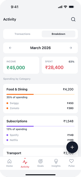
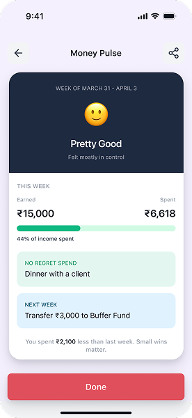
Full 30+ screen product — Onboarding, Dashboard, Budget, Invoice Tracker, Reports, and Settings flows.
0+
Screens — full product coverage
0
Flows — Onboarding · Budget · Invoice · Reports · Settings
0
Personas — The Starter & The Scaling Freelancer
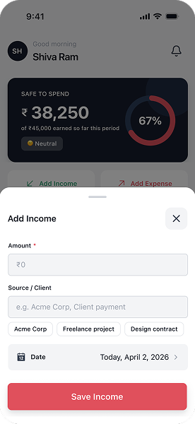
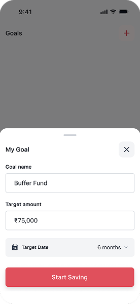
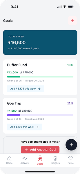
Selected Screens