HumAIns
Designing certainty into every hiring decision.
The Brief
Hiring is still a gut-feel process. Zai changes that.
HumAIns is an AI interview intelligence platform. Their AI, Zai, joins every video interview — analyzing voice, vision, behaviour, and biometrics in real time. The brief: design a landing page that makes enterprise recruiters trust AI-assisted hiring, not fear it.
The challenge isn't explaining what Zai does. It's making a skeptical VP of Talent Acquisition believe it's safe, accurate, and worth replacing their current process.
The Challenge
Enterprise buyers don't convert on features.
They convert on trust signals and proof. B2B SaaS landing pages for AI products face a unique credibility problem. The buyer has likely seen dozens of overpromising AI demos. The design had to cut through that fatigue with honest, specific proof — real testimonials, measurable outcomes, and a clear "before vs after" contrast.
The page also had to answer three silent questions every enterprise buyer asks: Does it work? Is it safe? Will it fit my stack?
What I Decided
Lead with the outcome. Then earn the explanation.
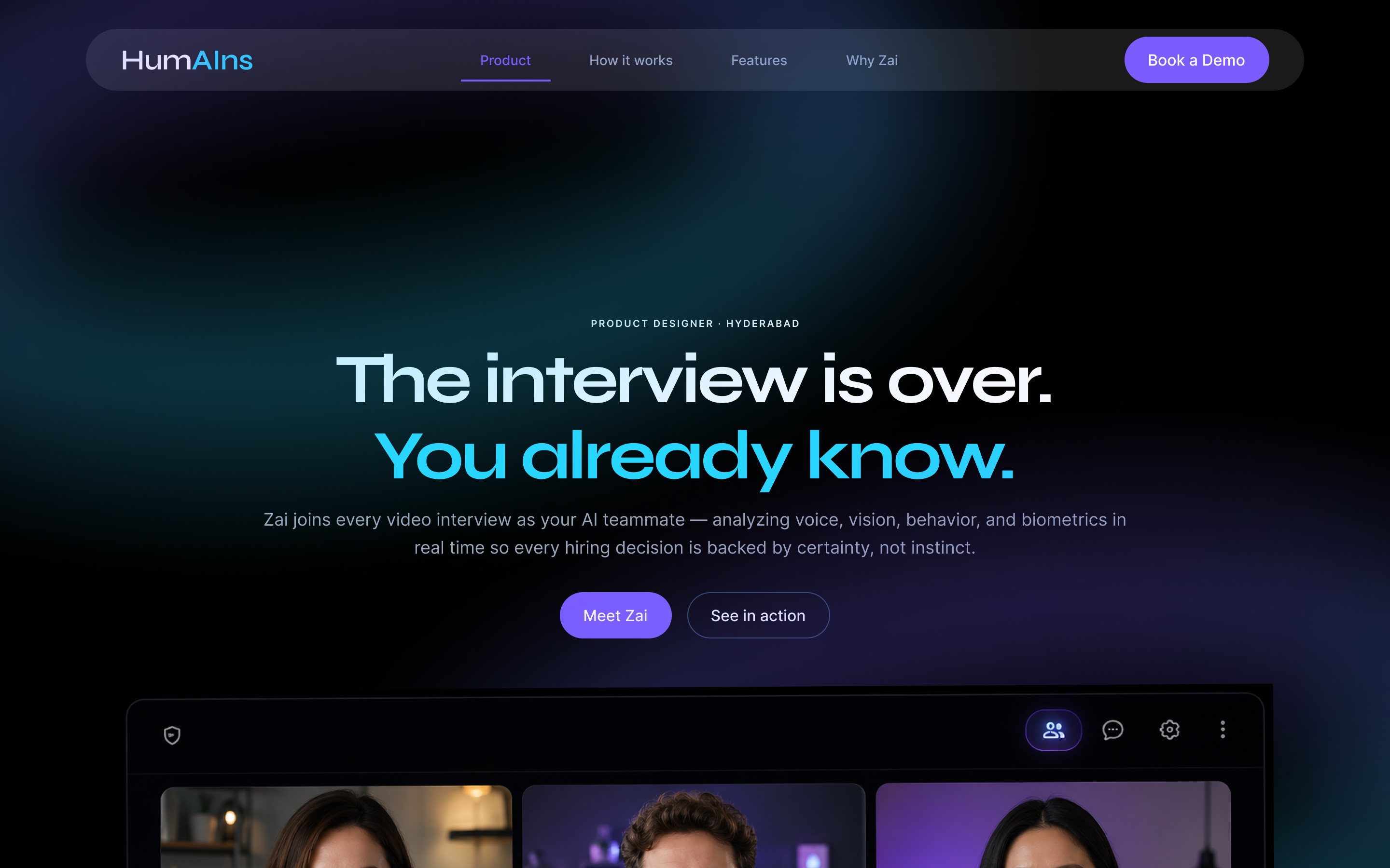
The hero doesn't explain how Zai works. It declares the outcome: "The interview is over. You already know." That single line does more conversion work than a feature list ever could.
Below it, the page follows a trust-building arc: problem validation → capability proof → social proof → CTA. Each section earns permission for the next.
Competitive Audit
Reviewed HireVue, Karat, Metaview, and Interviewing.io. Identified pattern: all lead with features, none lead with outcomes.
Messaging Strategy
Defined the hero line, problem section framing, and CTA hierarchy. Outcome-first approach throughout.
Design System
Pages: Foundations, Components, Screens, Tokens. Dark theme (#3A3939 bg), Electric Blue accent, Display 2XL → Caption text scale.
Component Library
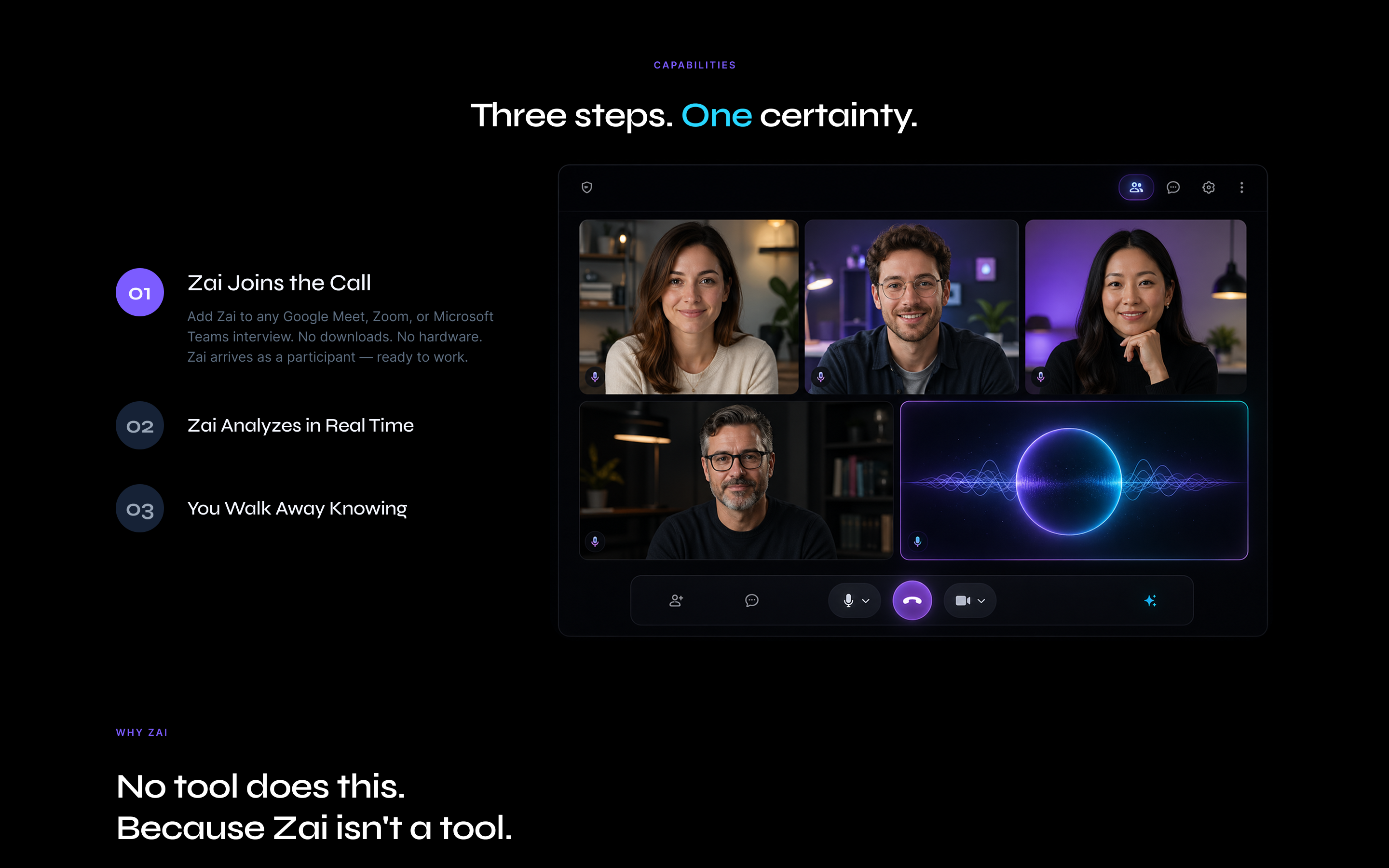
Nav, hero block, stat counters, feature cards (2-col grid), capability steps, testimonial carousel, CTA section, footer.
Visual Design
Full homepage at 1280px. Neon glow video call mockup for hero. "Before Zai" red checklist vs "With Zai" teal checklist contrast section.
Prototype & Handoff
Figma with scroll sections, carousel states, and hover interactions on all CTAs.
What I Wouldn't Do
I didn't explain the AI. I showed the before.
Most AI product pages spend 80% of the space explaining the technology. Recruiters don't care about the model architecture. They care that they've been making million-dollar decisions on gut feel, and that there's now a better way.
The "Before Zai" section lists every pain point they already feel — no objective data, identity fraud risks, inconsistent debriefs — so when the solution appears, it feels like relief, not a sales pitch.
I also chose not to use a product screenshot as the hero. The video call UI with Zai's glowing orb as a participant is more emotionally compelling than a dashboard screenshot. It puts the buyer inside the moment Zai works.
Selected Screens